Overview
Students were asked to design a type specimen book using a preferred typeface. This project aimed to introduce students to various typefaces, their characteristics, usage, and also provide a comprehensive yet accessible resource that aids students in understanding typography fundamentals and encourages exploration, research and experimentation with type.
Why Poppins?
I chose to work on Poppins for a few reasons but the most important of them all is that Poppins Typeface was inspired by my childhood Idol Mary Poppins. Secondly, I spend a lot of time in the digital world, for me content clarity reigns supreme. Poppins excels in this area, with crisp letterforms and generous spacing even at lower sizes. This makes it ideal for mobile apps and websites with limited screen space.
Target Audience
Design Students, Designers, Typographers, and Printers.


My Approach
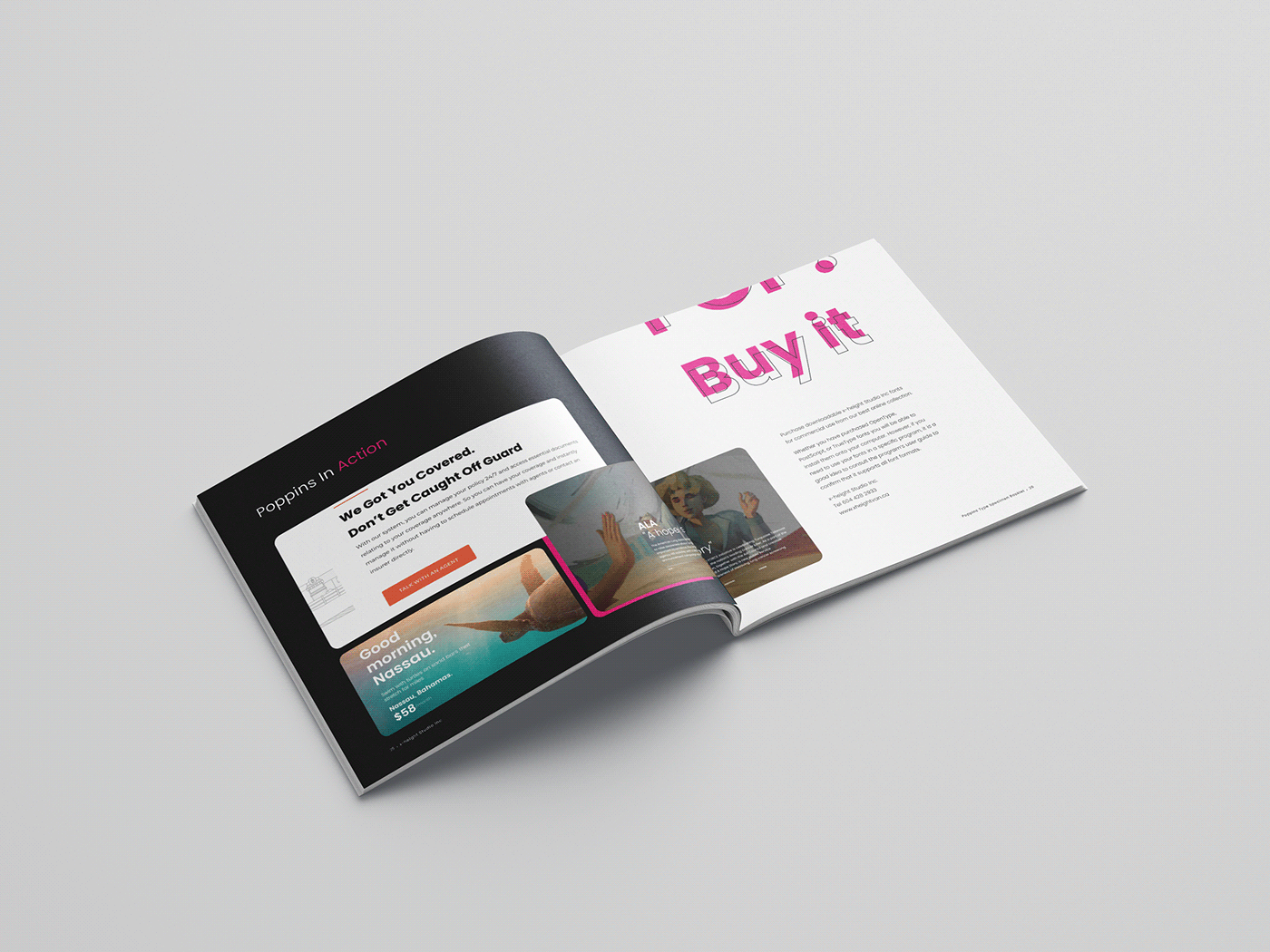
Whenever I think of Poppins Type, the word POP comes into my head. It evokes a feeling of excitement, playfulness, and modernity for me. This influenced my colour choices, using bright colours to display the feeling of excitement and overlapping texts in their solid and outline forms to show playfulness.
The Poppins typeface was designed using geometric shapes, which is why I used geometric shapes as part of my design elements for this publication.


My Approach
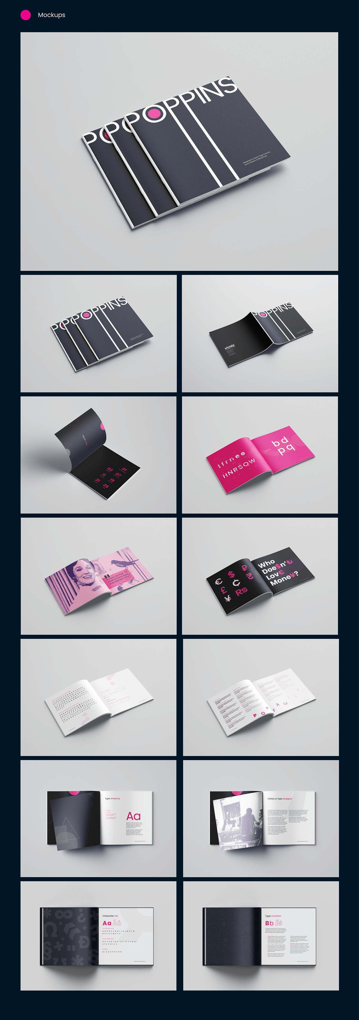
The design of the specimen book employs pink, dark Midnight blue and white as the major colour palette. However, the pink makes it whimsical and exciting.
The elements are well-aligned to each other. Spacing is well-considered to enhance readability and legibility. To create a subtle and exciting look for the book, bright colours were paired with light font variants for subheaders and body copy to improve readability.
As the book tends to evoke a fun feeling, every opened page has something new to show to keep readers immersed in it.


